Great Food
Year: 2008
Size: A format Paper Back - 181mm x 111mm
Picture Editor: Samantha Johnson
Lettering Artist: Stephen Raw
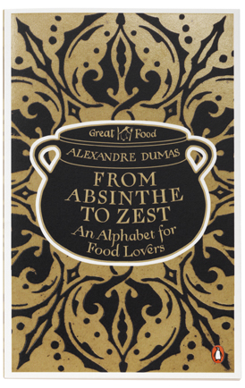
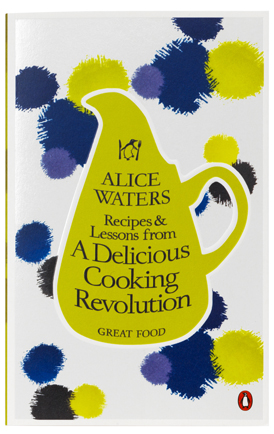
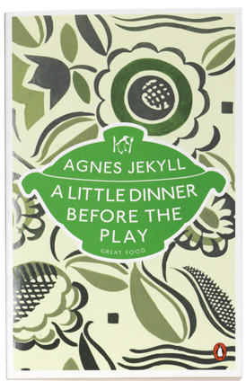
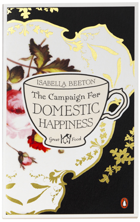
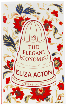
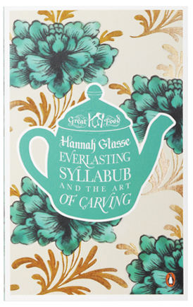
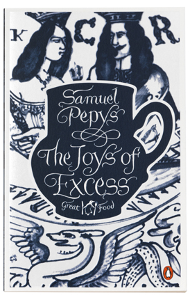
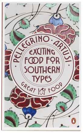
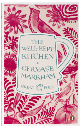
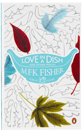
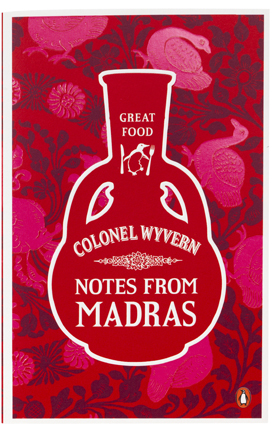
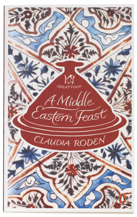
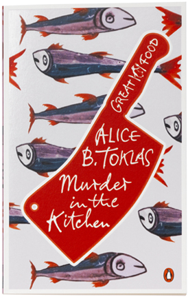
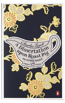
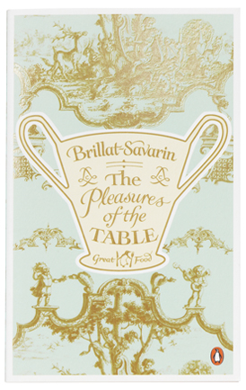
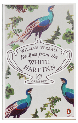
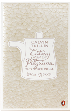
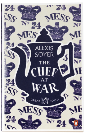
ach ceramic shape is historically relevant to the book, not only the period it was written in but what kitchen implements were used in the recipes and the pattern behind the shape is also from a certain ceramic piece of the relevant period. Then to tie it all together the typography was to echo the ceramic mark found on the back of the ceramics of that period. I commissioned lettering artist Stephen Raw to work on the lettering who I have worked with before on the Books for Boys series. Samantha Johnson our in house picture editor went off to London library and started researching also, we read, talked and investigated ceramics from the relevant periods and eventually got a series style going. The first to come together was pleasures of the table. A Sèvres hot chocolate cup with a Sèvres pattern with the typography being influenced by the Sèvres ceramic mark.


